

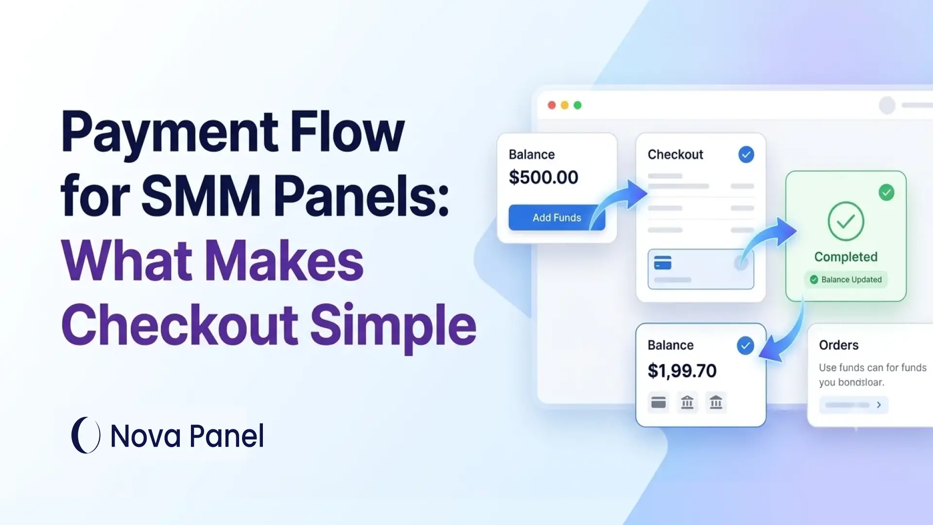
Payment Flow for SMM Panels: What Makes Checkout Simple
A simple payment flow is one of the most important parts of an SMM panel.
A customer may like your service catalog, understand your pricing, and want to place an order. But if the payment process feels confusing, slow, or unclear, they may leave before adding funds.
For an SMM panel, checkout is not only about accepting money.
It is about trust.
Customers need to understand:
- how to add funds
- which payment methods are available
- what amount will be credited
- whether fees apply
- when the balance will update
- where to see transaction history
- what happens if payment fails
- how refunds or balance credits work.
A strong payment flow makes the panel feel professional and easy to use.
A weak payment flow creates hesitation, support tickets, abandoned top-ups, and lost orders.
In this article, we will explain how payment flow works in an SMM panel, what makes checkout simple, which mistakes to avoid, and how Nova Panel helps create a more organized payment and balance experience.
What Is Payment Flow in an SMM Panel?
Payment flow is the process a customer follows to add funds or pay inside an SMM panel.
In many SMM panels, the customer does not pay separately for every order. Instead, they top up their account balance first and then use that balance to place orders.
A typical payment flow may look like this:
- The user logs in.
- The user opens the Add Funds page.
- The user chooses a top-up amount.
- The user selects a payment method.
- The user confirms the payment.
- The payment is processed.
- The balance is updated.
- The user places orders from the balance.
This is different from a simple one-time checkout on a regular website.
An SMM panel usually works as a repeat-use platform. Customers may place many small or frequent orders, so the balance system makes the process faster and more convenient.
The payment flow connects several important parts of the panel:
- customer dashboard
- account balance
- top-up page
- payment methods
- transaction history
- order system
- refund or credit rules
- support workflow.
When these parts work together clearly, the customer experience feels smooth.
Why Payment Flow Matters
Payment flow affects both conversion and trust.
If users cannot easily add funds, they cannot place orders.
If users do not understand what happens after payment, they may hesitate before adding balance.
If balance does not update clearly, they may contact support or lose confidence.
A good payment flow helps with:
- higher top-up completion
- fewer abandoned payments
- faster repeat ordering
- lower support workload
- clearer transaction records
- better customer trust
- stronger retention
- easier reseller usage
- more organized cash flow.
A poor payment flow can create the opposite:
- users leave before topping up
- customers ask the same payment questions repeatedly
- balance disputes become harder to solve
- small payment fees reduce profit
- support spends time checking transactions manually
- customers feel unsure about using the panel again.
Payment flow is not just a technical detail.
It is part of the customer experience.
Payment Flow vs Balance Top-Up
In an SMM panel, payment flow and balance top-up are closely connected, but they are not exactly the same.
A balance top-up is the action of adding funds to a user account.
A payment flow is the full process around that action.
Payment flow includes:
- where the user finds the top-up page
- how the amount is selected
- how payment methods are displayed
- what instructions are shown
- whether fees are explained
- how payment status is communicated
- how the balance updates
- how transaction history is recorded
- how support handles issues.
In simple terms:
Balance top-up is the transaction.
Payment flow is the experience around the transaction.
A good SMM panel needs both.
The balance system helps customers order repeatedly.
The payment flow makes adding that balance simple, clear, and trustworthy.
What Makes Checkout Simple in an SMM Panel?
A simple checkout is not only about fewer clicks.
It is about reducing doubt.
Customers should always understand what they are doing, what they are paying, what they will receive, and what happens next.
A simple SMM panel checkout should be:
- easy to find
- easy to understand
- transparent about fees
- clear about processing time
- connected to account balance
- visible in transaction history
- supported by clear statuses
- supported by simple help text
- consistent across the dashboard.
The customer should not feel lost at any step.
If a user has to contact support just to understand how to add funds, the payment flow needs improvement.
The Standard SMM Panel Payment Flow
A clean payment flow usually follows a predictable path.
Step 1: The User Finds the Add Funds Page
The Add Funds page should be easy to find.
Common labels include:
- Add Funds
- Top Up Balance
- Add Balance
- Deposit
- Balance Top-Up.
The wording should be simple.
Avoid hiding the payment page inside confusing menus.
A customer should be able to log in and quickly understand where to add money.
Good placement matters.
The Add Funds button can appear in:
- dashboard header
- balance card
- account menu
- order page when balance is low
- payment section
- mobile menu.
If adding funds is difficult to find, customers may leave before ordering.
Step 2: The User Sees the Current Balance
Before topping up, the customer should clearly see their current balance.
This helps them understand whether they need to add funds and how much they may want to add.
A simple balance card can show:
- current balance
- currency
- recent top-up status
- Add Funds button
- transaction history link.
This is especially useful for repeat customers and resellers.
If users manage many orders, they need quick balance visibility.
A hidden or unclear balance creates confusion.
Step 3: The User Chooses a Top-Up Amount
The top-up amount should be easy to select.
You can offer:
- fixed amount buttons
- custom amount input
- minimum top-up rule
- recommended amounts
- reseller-focused larger options.
For example:
- $10
- $25
- $50
- $100.
Fixed amounts make checkout faster.
Custom amounts give flexibility.
The best choice depends on your audience.
A reseller-focused panel may benefit from larger top-up options.
A beginner-friendly panel may need lower starting amounts.
The key is clarity.
The user should understand:
- minimum amount
- maximum amount, if relevant
- supported currency
- whether fees apply
- final credited balance.
Step 4: The User Selects a Payment Method
Payment method selection should be simple and organized.
Do not overload the customer with unclear options.
For each payment method, show useful information:
- payment method name
- processing time
- minimum top-up amount
- fee information, if relevant
- important instructions
- whether confirmation is instant or manual.
The user should not need to guess.
If one method takes longer than another, say so.
If a method has a minimum amount, show it before the user tries to pay.
If a method requires manual confirmation, explain what happens next.
Clear expectations reduce support tickets.
Step 5: The User Reviews the Payment Summary
Before confirming payment, the user should see a simple summary.
The summary should include:
- selected amount
- payment method
- fee, if any
- final credited balance
- account receiving the balance
- processing note
- confirm button.
This step is important because balance top-ups involve trust.
The user is adding money before placing an order.
They need to know exactly what will happen.
A clear payment summary prevents surprises.
For example:
- Top-up amount: $50.00
- Payment fee: $1.00
- Balance to be credited: $49.00
- Payment method: Selected method
- Status after payment: Pending until confirmed
If there is no fee, that should also be clear.
Transparency builds confidence.
Step 6: The Payment Is Submitted
After confirmation, the user completes the payment.
Depending on the payment setup, the result may be:
- instant confirmation
- pending confirmation
- manual review
- failed payment
- canceled payment
- expired payment request.
The panel should show a clear message after submission.
For example:
“Your payment request has been created. Your balance will update after confirmation.”
Or:
“Payment completed. Your balance has been updated.”
The customer should never be left wondering whether the payment was received.
Step 7: The Payment Status Is Updated
Payment statuses should be simple and visible.
Common payment statuses may include:
- Pending
- Processing
- Completed
- Failed
- Canceled
- Refunded.
Each status should have a clear meaning.
Pending
The payment request was created, but the payment has not been confirmed yet.
Processing
The payment is being reviewed or processed.
Completed
The payment was confirmed and the balance was credited.
Failed
The payment did not go through.
Canceled
The payment request was canceled or expired.
Refunded
The payment was returned or credited back according to the platform rules.
Good payment statuses reduce anxiety.
If the user sees what is happening, they are less likely to contact support immediately.
Step 8: The Balance Is Updated
Once the payment is confirmed, the user balance should update clearly.
The dashboard should show:
- new balance
- top-up amount
- credited amount
- transaction status
- date and time
- transaction reference, if available.
This gives users confidence that their payment was recorded.
If the balance does not update instantly, the system should explain why.
For example:
“Your payment is pending confirmation. Your balance will update once the payment is approved.”
This is much better than showing nothing.
Silence creates support tickets.
Clear status creates confidence.
Step 9: The User Places Orders From the Balance
After the balance is available, the customer can place orders.
A good order flow should show:
- selected service
- quantity
- order cost
- current balance
- balance after order, if possible.
The user should understand how much will be deducted before submitting the order.
This connects payment flow with order flow.
Checkout does not end when the balance is added.
It continues into the ordering experience.
Step 10: The Transaction Is Saved in History
Every top-up should appear in transaction history.
Transaction history helps both customers and support teams.
It should show:
- transaction ID or reference
- date and time
- amount
- credited balance
- payment method
- status
- related notes, if needed.
Customers should be able to review their own payment history.
Admins should be able to investigate payment issues quickly.
Without transaction history, support becomes harder.
A customer may ask:
“Where did my payment go?”
With proper history, the answer is easier to find.
15 Key Elements of a Simple SMM Panel Checkout
A simple checkout is built from many small details.
Here are the most important ones.
1. Clear Add Funds Button
The Add Funds button should be visible and easy to understand.
Do not hide it.
Do not use confusing labels.
The user should know exactly where to click when they want to add balance.
2. Visible Current Balance
Balance should be visible in the dashboard.
Users should not need to search for it.
A clear balance display helps users decide when to top up and how much to add.
3. Simple Top-Up Amounts
Offer clear top-up options.
Fixed amounts can help users decide faster.
Custom amounts can help advanced users.
Minimums should be visible before checkout.
4. Transparent Fees
If fees apply, show them before payment.
Customers should understand:
- what they pay
- what fee applies
- what balance they receive.
Hidden fees can damage trust.
5. Clear Payment Method Information
Each payment method should include basic details.
Useful details include:
- processing time
- minimum amount
- fee information
- confirmation type
- special instructions.
Customers should not need to guess how a method works.
6. Payment Summary Before Confirmation
Before the user confirms payment, show a clear summary.
This reduces mistakes and gives the user confidence.
A summary is especially important if fees, minimums, or manual confirmation apply.
7. Customer-Friendly Statuses
Payment statuses should be simple.
Avoid technical wording.
Use clear terms such as:
- Pending
- Processing
- Completed
- Failed
- Canceled.
If something goes wrong, explain the next step.
8. Transaction History
Transaction history builds trust.
Users should see payment records, top-up history, balance credits, and refunds.
Admins should also be able to review these records when support questions appear.
9. Simple Error Messages
Payment errors should be clear and useful.
Avoid raw technical errors.
Instead of:
“Error code 400: invalid callback response.”
Use:
“This payment could not be completed. Please try again or contact support.”
The admin can still see technical details in the backend.
The customer should see a simple explanation.
10. Easy Support Access
If payment fails or balance does not update, users need a clear support path.
The payment page should explain:
- how to contact support
- what information to include
- whether transaction ID is needed
- how long review may take.
This reduces frustration.
11. Mobile-Friendly Checkout
Many users may access the panel from a mobile device.
The payment flow should be easy to use on smaller screens.
Check:
- button size
- form spacing
- payment method selection
- confirmation summary
- status messages
- transaction history.
A checkout that works well on desktop but feels confusing on mobile can lose users.
12. Clear Refund and Balance Rules
Users should understand what happens if:
- payment fails
- payment is duplicated
- order is canceled
- order is partial
- balance credit is issued
- unused balance remains.
Rules should be available in:
- FAQ
- Terms of Service
- payment page
- support documentation.
Clear rules protect both the customer and the business.
13. Minimum Top-Up Logic
Minimum top-up amounts can help protect profitability.
Small transactions may create problems because payment fees can take a large percentage of the amount.
A minimum top-up helps:
- reduce fee impact
- avoid tiny transactions
- improve cash flow
- encourage repeat ordering
- reduce admin workload.
But the minimum should not be too high for your audience.
A beginner-friendly panel may need a lower entry point.
A reseller-focused panel may use higher minimums.
The goal is to protect the business without creating unnecessary friction.
14. Admin Payment Visibility
Checkout simplicity is not only about the customer side.
Admins need clear payment visibility too.
Admin tools should help the owner review:
- pending payments
- completed payments
- failed payments
- credited balances
- transaction history
- payment method performance
- customer payment issues
- refund or credit activity.
If admins cannot quickly understand payment activity, support becomes slower.
A good payment flow should be clear for both customers and owners.
15. Consistent Design and Language
Payment pages should look and feel consistent with the rest of the panel.
If checkout suddenly looks different, customers may feel unsure.
Use consistent:
- buttons
- labels
- colors
- status names
- instructions
- confirmation messages.
Consistency makes the experience feel more professional.
Common Payment Flow Mistakes in SMM Panels
Payment problems often come from unclear communication, not only technical issues.
Here are common mistakes to avoid.
Mistake 1: Hiding the Add Funds Page
If users cannot easily find where to add funds, they may leave.
Make the balance and Add Funds button visible.
Mistake 2: Not Showing Fees Clearly
Hidden fees create distrust.
Show fees and final credited balance before payment confirmation.
Mistake 3: No Clear Payment Status
After payment, users need to know what is happening.
If the payment is pending, show Pending.
If it failed, show Failed.
Do not leave users guessing.
Mistake 4: No Transaction History
Without transaction history, users and support teams cannot easily review payment activity.
Every top-up should be recorded.
Mistake 5: Confusing Payment Instructions
If instructions are unclear, users may make mistakes.
Keep payment instructions short, specific, and visible.
Mistake 6: Weak Mobile Experience
A payment flow that is difficult on mobile can reduce conversions.
Test the full process on different screen sizes.
Mistake 7: No Refund or Balance Policy
If users do not understand refund or balance credit rules, disputes may increase.
Explain the rules clearly before issues happen.
Mistake 8: Manual Payment Tracking for Too Long
Manual payment tracking may work at the beginning, but it becomes difficult as the business grows.
A more structured payment flow helps reduce mistakes and support pressure.
Mistake 9: Raw Technical Errors
Customers should not see technical payment errors.
Use simple messages for users and keep technical details for admins.
Mistake 10: Not Testing the Full Checkout Flow
Before sending traffic to your panel, test the full payment journey.
Do not assume it works just because the payment page exists.
How to Test Your SMM Panel Payment Flow
Before launching or promoting your panel, test the payment flow like a real customer.
Go through the full process:
- Create a test account.
- Open the dashboard.
- Find the Add Funds page.
- Choose a top-up amount.
- Select a payment method.
- Review the payment summary.
- Submit the payment.
- Check the payment status.
- Confirm balance update.
- Place an order.
- Check balance deduction.
- Review transaction history.
- Test failed or canceled payment scenarios.
- Check mobile experience.
- Contact support as a test user.
During testing, ask:
- Is the Add Funds button easy to find?
- Is the current balance visible?
- Are fees clear?
- Is the final credited amount shown?
- Are payment statuses understandable?
- Does transaction history update correctly?
- Are error messages helpful?
- Does the user know what to do if something goes wrong?
Testing helps you find friction before customers experience it.
Payment Flow Metrics to Track
To improve checkout, track the right metrics.
Useful payment metrics may include:
- visitors to Add Funds page
- top-up attempts
- completed top-ups
- failed top-ups
- pending payments
- abandoned payment attempts
- average top-up amount
- most used payment methods
- support tickets about payments
- time from top-up to first order
- repeat top-up rate
- refund or balance credit frequency.
These metrics help you understand where users get stuck.
For example:
If many users open Add Funds but do not complete payment, the method selection or trust signals may need improvement.
If many payments stay pending, processing instructions may need to be clearer.
If support tickets about balance are high, transaction history or status messages may need improvement.
A better payment flow is built through testing and data.
How Payment Flow Affects Resellers
Resellers often place many orders over time.
For them, payment flow is especially important.
A reseller needs:
- quick balance top-ups
- clear transaction history
- higher top-up options
- predictable processing
- visible balance
- order cost clarity
- reseller pricing transparency
- support for payment questions.
If the payment flow is slow or confusing, resellers may lose time.
A clean payment experience can help resellers work more efficiently and place repeat orders with less friction.
For reseller-focused panels, it can also make sense to think about:
- minimum balance requirements
- volume-based pricing
- larger top-up presets
- clear account-level rules
- payment history export or review options.
Resellers care about speed, clarity, and control.
A strong payment flow supports all three.
How Payment Flow Affects Customer Trust
Trust is one of the biggest reasons checkout matters.
Users are more careful when money is involved.
Before adding funds, they want to feel that the platform is organized and reliable.
Trust can be improved with:
- clear design
- visible balance
- transparent fees
- clear statuses
- transaction history
- support contact
- FAQ
- Terms of Service
- refund and balance rules
- consistent branding
- helpful confirmation messages.
The goal is to remove uncertainty.
A customer should not wonder:
- Did my payment go through?
- Where is my balance?
- Why was a fee deducted?
- What happens if payment fails?
- Who do I contact?
If the payment flow answers these questions, users are more likely to complete checkout and return later.
How Nova Panel Helps With Payment Flow
Nova Panel is designed for entrepreneurs who want to launch and manage an SMM panel without building the full system from scratch.
A strong payment flow works best when the platform has a clear structure.
Nova Panel helps provide the foundation for important parts of an SMM panel business, including:
- customer dashboard
- balance top-ups
- payment flow
- service catalog
- order management
- user accounts
- account settings.
This structure helps customers understand how to add funds, place orders, track activity, and manage their account.
For the owner, a more organized payment and balance flow can reduce confusion, support questions, and manual tracking.
A clear checkout experience also supports growth because visitors are more likely to become paying users when the payment process feels simple and predictable.
Nova Panel gives you the tools to launch faster, manage your SMM panel more easily, and create a more professional customer experience.
Final Thoughts
A simple payment flow is one of the most important parts of an SMM panel.
If users cannot easily add funds, they cannot easily place orders.
If checkout feels confusing, users may hesitate.
If payment status is unclear, support tickets increase.
A good SMM panel payment flow should be:
- easy to find
- simple to understand
- transparent about fees
- clear about processing time
- connected to account balance
- supported by transaction history
- mobile-friendly
- supported by clear statuses
- connected to support when needed.
The best checkout experience is not necessarily the one with the fewest screens.
It is the one where the customer always understands what is happening.
Nova Panel gives you the tools to manage balance top-ups, payment flow, orders, services, users, and customer dashboards without building everything from scratch.
FAQ
What is payment flow in an SMM panel?
Payment flow is the process users follow to add funds or pay inside an SMM panel. It includes choosing a top-up amount, selecting a payment method, confirming payment, seeing payment status, and receiving balance in the dashboard.
Why do SMM panels use balance top-ups?
SMM panels use balance top-ups because customers often place repeat orders. Adding funds once and ordering from account balance is faster and more convenient than paying separately for every order.
What makes SMM panel checkout simple?
A simple checkout is easy to find, clear about fees, shows the final credited amount, uses understandable statuses, updates balance clearly, saves transaction history, and provides support instructions when needed.
Should an SMM panel show payment fees?
Yes. If fees apply, they should be shown before the customer confirms payment. Users should understand how much they pay and how much balance they receive.
What payment statuses should an SMM panel use?
Common statuses include Pending, Processing, Completed, Failed, Canceled, and Refunded. The exact statuses depend on your workflow, but they should be simple and customer-friendly.
Why is transaction history important?
Transaction history helps users review top-ups, credited balance, payment status, and refunds. It also helps support teams resolve payment questions faster.
How can I reduce abandoned top-ups?
Make the Add Funds page easy to find, show fees clearly, explain processing time, use simple payment instructions, provide clear statuses, and make the checkout experience mobile-friendly.
How can Nova Panel help with payment flow?
Nova Panel gives you the structure to manage customer dashboards, balance top-ups, payment flow, orders, services, user accounts, and account settings.
This helps create a clearer and more organized payment experience for customers.